Case study
Charted Currents
An exploratory atlas of the maritime Greater Caribbean, 1650–1730, built so that every claim on the map can be traced back to the archival record that supports it — and so the gaps stay visible.
What it is
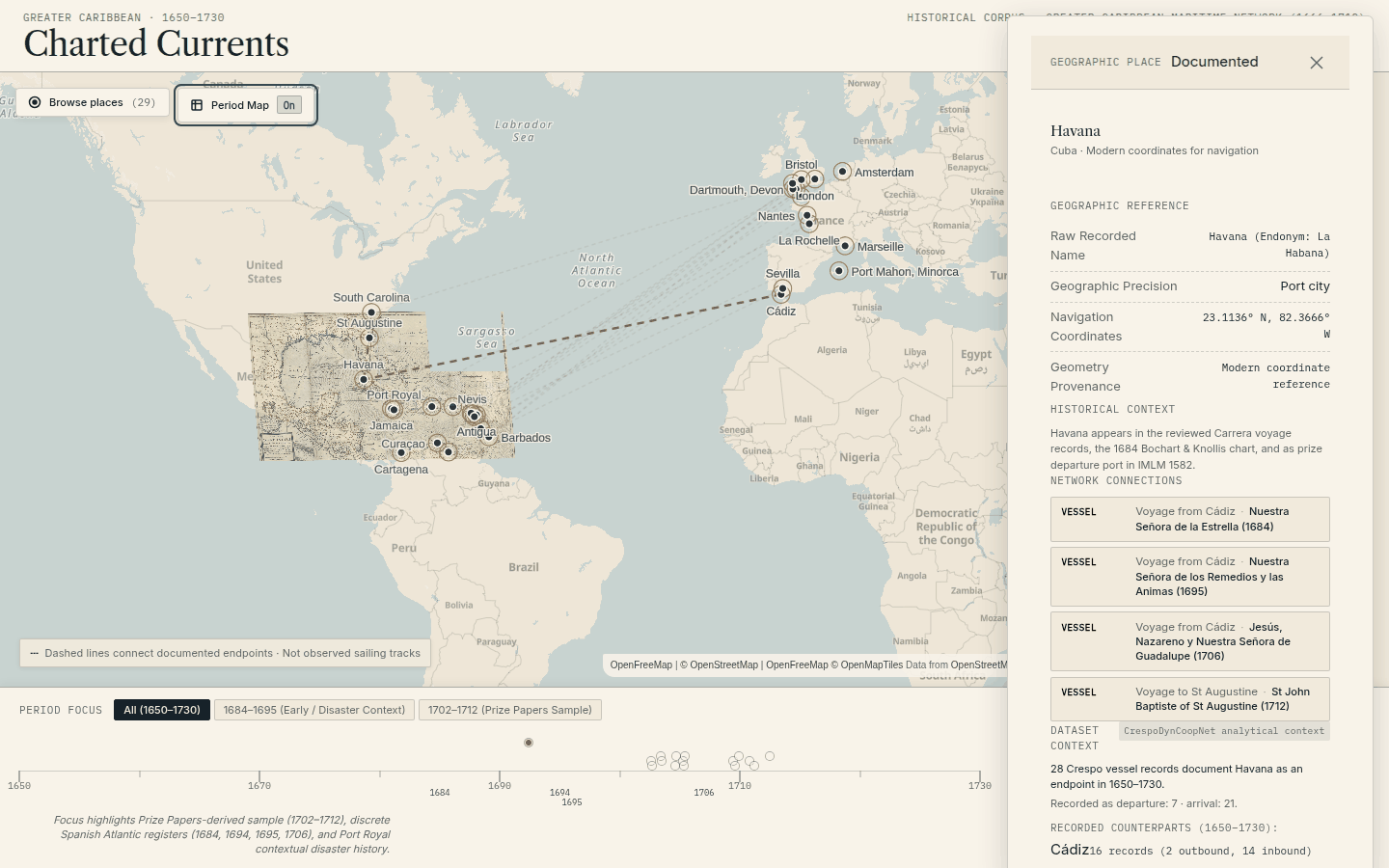
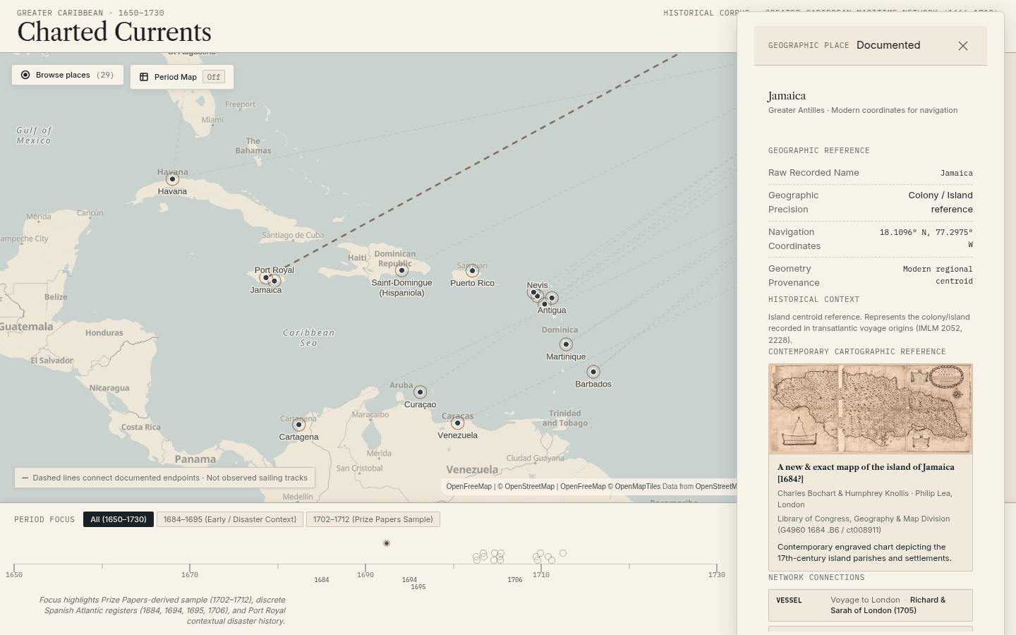
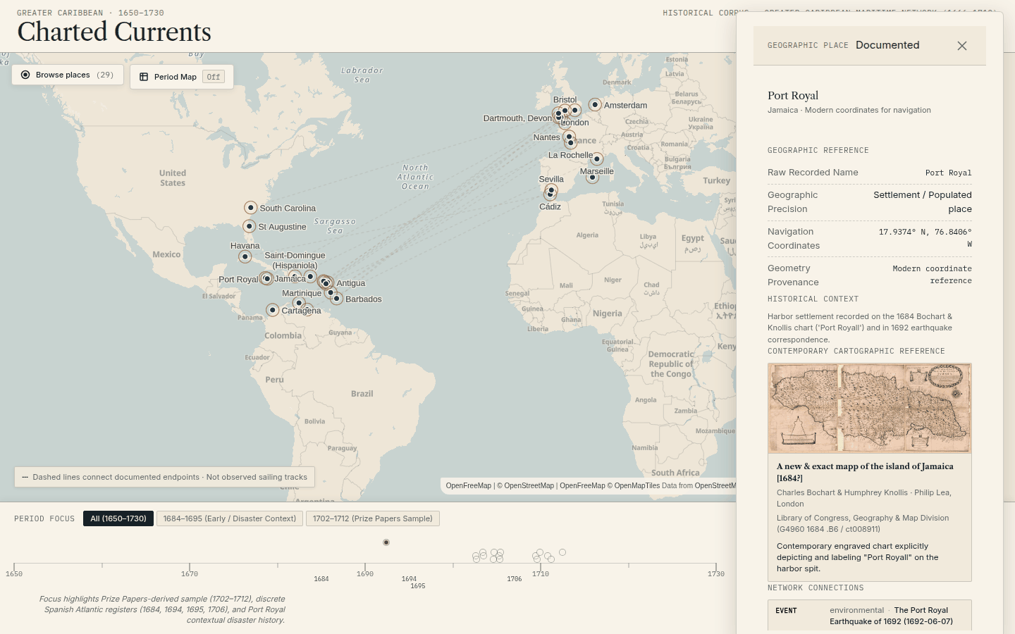
Charted Currents is an exploratory atlas of the maritime Greater Caribbean between roughly 1650 and 1730 — ships, ports, voyages, people, commerce, and the wars and disasters they happened around. It is a map you click into: select Havana and you get its recorded name, its coordinate provenance, the vessels documented as arriving or departing, and a contemporary chart of the place as it was drawn at the time.
The corpus is deliberately small and reviewed rather than large and scraped: 22 vessels, 29 resolved places, 16 dated events, 12 sources, 252 source records and 1,342 individual assertions, drawn mainly from a Spanish Carrera de Indias research database and a UK Data Service dataset of English admiralty depositions, plus a documentary thread reached through the Nationaal Archief’s finding aid for the Prize Papers.
What makes it worth writing about is not the size of the corpus. It is that the whole thing is built to be argued with.
Why I built it
I like historical data and I distrust historical data visualizations. The genre has a habit of drawing a confident line between two ports and letting you assume somebody watched a ship sail it. Usually nobody did. What survives is a customs register, or a deposition taken after a capture, naming a departure and an arrival and nothing in between.
So the interesting constraint was not “can I map this” but “can I map this
without lying.” Every line on this map connects two documented endpoints. It is
drawn dashed, it carries a permanent legend saying dashed lines connect
documented endpoints, not observed sailing tracks, and the underlying record
stores is_track_observed: false alongside a plain-language note about where the
geometry actually came from. The validator refuses to publish a route that
claims otherwise.
That pattern — state the uncertainty in the data, encode it in the interface, and enforce it in the build — is the spine of the project.
How the claims are kept honest
Three separate things are tracked separately, and the project is strict about not collapsing them into a single confidence number:
- Evidence state — is this documented, a probable match, reconstructed from a model, or merely contextual? Documented badges are drawn with a solid border and inferred ones with a dashed border, so the distinction survives being glanced at.
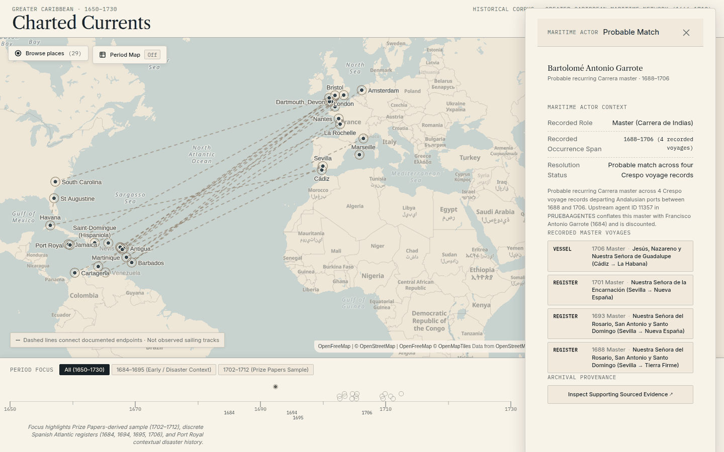
- Claim class — what kind of reasoning produced this? Transcribing a tonnage from a register is not the same operation as deciding that four separate records naming the same shipmaster are one person.
- Review state — what checking has happened? With the rule that review strength can never upgrade evidence strength. A reviewed probable match is still a probable match.
Some of this is enforced mechanically, which is the part I am happiest with. The
build fails if a derived assertion carries a raw source value. It fails if a
commercial goods record would represent enslaved people as cargo — a stated
ethical commitment compiled into an assertion rather than left in a style guide.
It fails on a list of forbidden phrases — “voyages used,” “traffic volume,”
“ships sailed” — because the underlying count is archival register rows, and
those phrasings would quietly promote a record into a sailing. An unmapped
place has to report null,
never zero, so archival silence never renders as a measured absence. And CI
regenerates the entire published corpus and fails if it differs from what is
committed by a single byte, which makes the published data a provable function
of the reviewed source.
There are thirty tests whose only job is to corrupt the data and confirm the validator catches it.
The correction
The best thing I can show you about this project is a mistake.
The 1715 Moll chart in the hero image was originally warped onto the modern map with a second-order polynomial through fourteen control points. It looked wrong — Florida bent west into the Gulf, Cuba visibly bowed — and measuring confirmed it: cross-validated error of 209.65 km. The audit found four separate causes, including control points placed on the wrong coast of Jamaica and a point for Cape Hatteras that sits off the edge of the engraving entirely.
The useful question was what projection the plate actually used, and rather than assume, I measured the engraved latitude parallels on the scan. They are evenly spaced — 122 pixels per degree, R² of 0.99995 — which says linear, not Mercator, and justifies a plain affine warp instead of polynomial curvature invented to paper over bad control points. Five of the chart’s six catalogued harbour insets are now masked out, because an inset of Havana harbour at its own scale does not belong warped into open ocean. Bermuda is deliberately not masked: it has no inset border and is real main-chart geography.
Final cross-validated error is 107.68 km, roughly half the original, and the whole thing is frozen into tests with per-port tolerances so it cannot silently regress. The published record for the overlay carries its method, control-point count, error figure, and a required plain-language disclaimer — a georeferenced 17th-century chart is an interpretation, and the data says so.
Screenshots
Technical shape
The front end is Astro with MapLibre GL, static output, no UI framework, and five runtime dependencies in total. The basemap is deliberately drained of colour — roads and shops muted almost out of existence — because a modern basemap here is interface infrastructure, not evidence. Fonts are bundled locally rather than pulled from a CDN.
Behind it is a Python pipeline over a hand-reviewed YAML corpus: source adapters read a Spanish research database and archival finding aids into candidate rows, those get reviewed, and a deterministic compiler turns the reviewed corpus into the JSON and GeoJSON the site loads. The georeferencing runs through GDAL. There is no database at runtime and no API — the published artifacts are files.
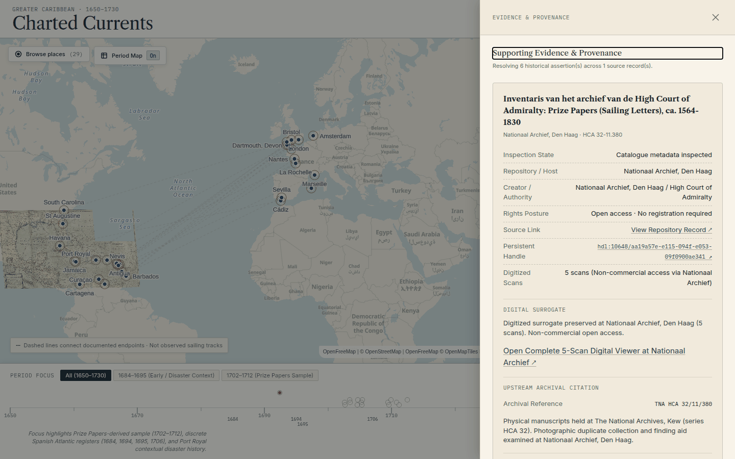
On rights, the code is MIT and the historical material explicitly is not. Each source carries its own rights posture, and where a repository licenses its scans for non-commercial research only, the project fails closed: it links out to the official viewer with a persistent handle rather than rehosting the images.
Like Networked Players, this was built with heavy use of AI coding agents, and the policy documents exist because of it. The most consequential failures on a project like this are not crashes. They are provenance inflation, an inference quietly promoted to a fact, or a completion summary that claims more than the repository supports. So the rules are written down and, wherever possible, executable.
What I learned
- Uncertainty has to be enforced somewhere the writer cannot casually override. A style guide saying “do not overclaim” loses to a good sentence; a validator that fails the build on the phrase “voyages used” does not.
- The thing worth building was not the map. It was the chain underneath it, and the map is how you inspect the chain.
- Measuring beats assuming, even about a 300-year-old copperplate. The projection question had an empirical answer sitting on the scan the whole time.
- A published mistake with its measurements attached is more credible than a clean record. The correction log is the part of this project I would show first.
- Archival silence is data. Rendering it as zero is a lie that looks like rigour.
Links
- Explore it: charted-currents.com
- Source: github.com/edonahue/charted-currents
- Related: Open Workbench